Client
Cake Lakes
Cake Lakes is a renowned bakery specializing in creating delectable and visually stunning cakes. With branches located in Perinthalmanna, Ottapalam, Pathamkulam, and Cheruthuruthy, Cake Lakes has become a favorite destination for cake lovers in these areas.
Concept
Logo, Website and Banner
Logo
The logo features a rounded shape resembling a cake, filled with layers or sections representing the various cake varieties offered by Cake Lakes. The rounded cake shape is divided into alternating segments of shades of blue and pink, creating a visually pleasing gradient effect.
The blue color represents trust, reliability, and professionalism, reflecting Cake Lakes’ commitment to delivering high-quality cakes and exceptional service. It symbolizes the brand’s reliability in creating memorable cakes for special occasions.
The pink color represents joy, celebration, and a touch of sweetness. It signifies the happiness and delight experienced when indulging in the delicious cakes crafted by Cake Lakes. Pink adds a playful and feminine touch to the logo, appealing to a wide range of customers.
Above the rounded cake shape, the brand name “Cake Lakes” is displayed in two tones: blue and pink. The word “Cake” is in blue, and “Lakes” is in pink. Each word is given a white stroke to enhance legibility and make it stand out against the background.
Beneath the rounded cake shape and the brand name, the tagline “Slice of Happiness” is placed. The tagline is set in a complementary color, such as white, to ensure clear visibility. It encapsulates the essence of Cake Lakes, emphasizing that their cakes bring joy and happiness to every occasion.
The typography used for the brand name and tagline should be carefully chosen to reflect the brand’s personality. It should be elegant, yet approachable, aligning with Cake Lakes’ professionalism and creativity.
Overall, the rounded cake logo concept with blue and pink colors, along with the tagline “Slice of Happiness,” conveys a sense of trust, joy, and celebration. It represents Cake Lakes as a reliable and delightful destination for high-quality cakes that bring happiness and create memorable moments.
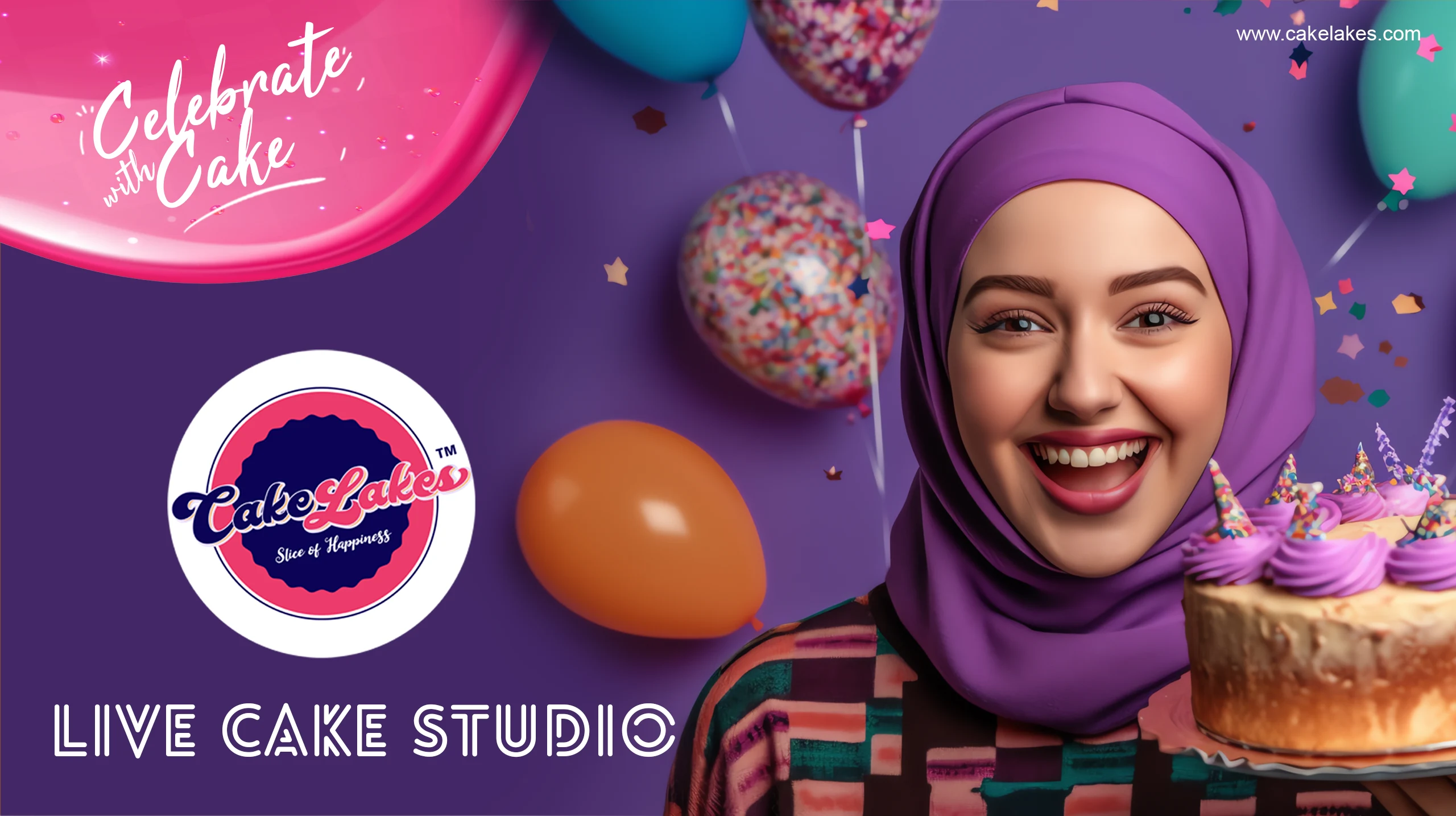
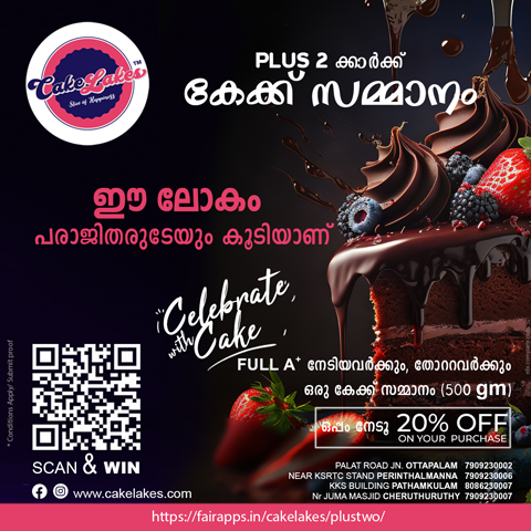
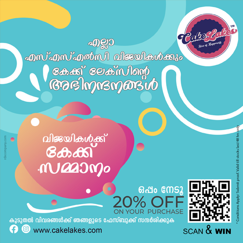
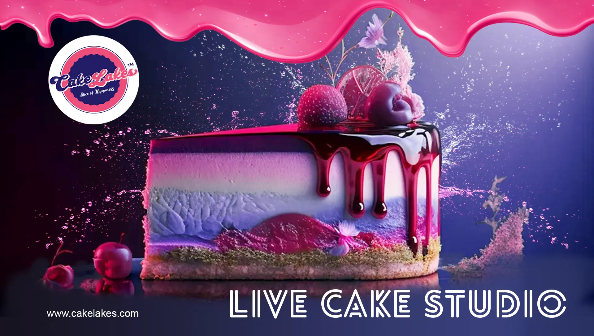
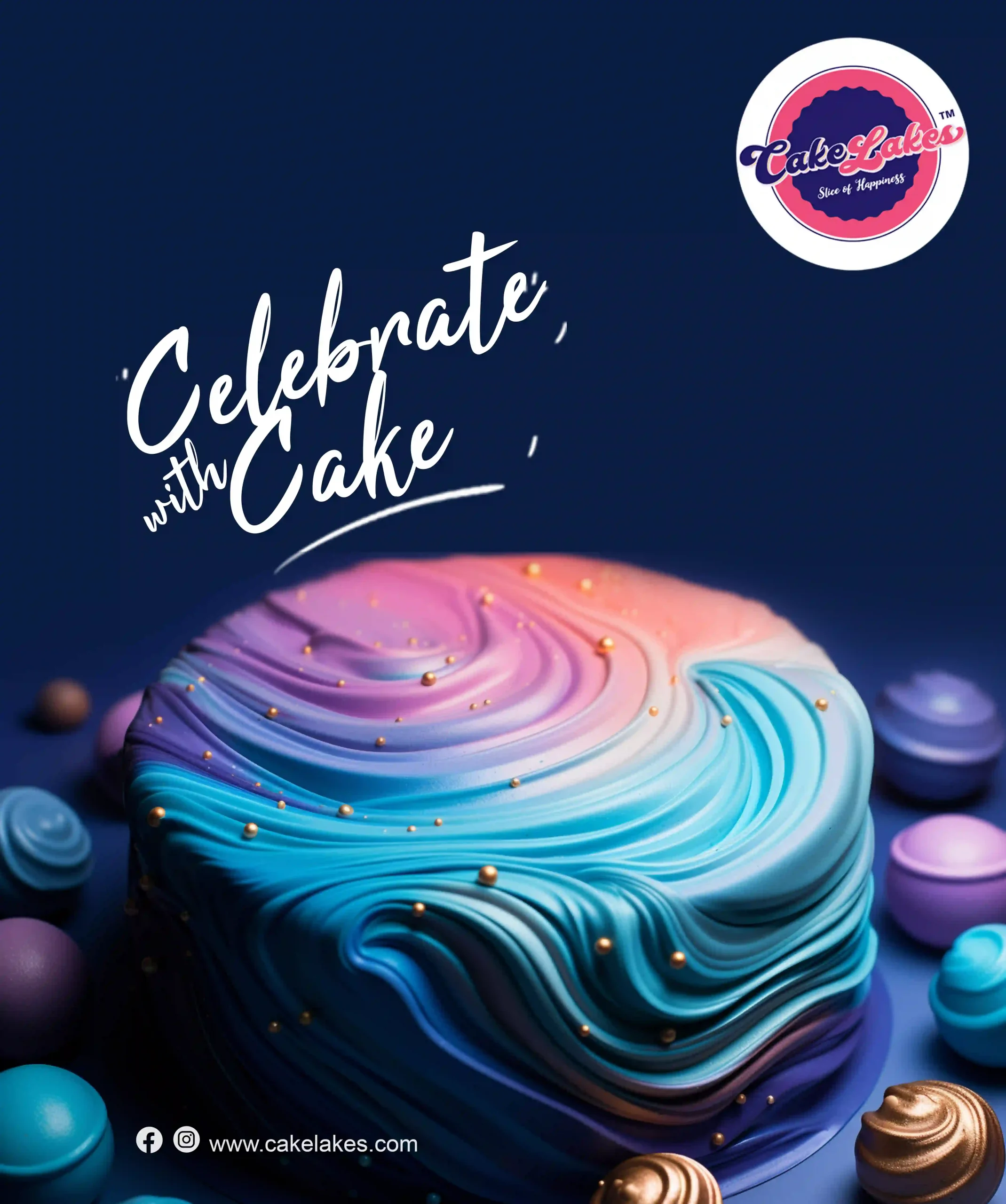
Banner
The banner showcases a visually stunning and mouthwatering cake as the centerpiece. The cake is meticulously designed, featuring intricate decorations and vibrant colors that make it truly captivating. It represents the craftsmanship and artistry that Cake Lakes is known for. Surrounding the cake are various elements that represent the different cake varieties and services offered by Cake Lakes. In the background, we gave a subtle pattern or gradient to add depth and visual interest to the banner.
Services
Cake Lakes
At Rainhopes, we are proud to have provided a comprehensive range of web development services to Cake Lakes, a renowned cake making company. As a trusted web development company, our goal was to enhance their online presence and create a seamless digital experience for their customers. Here’s an elaboration of the services we delivered:
Logo Design: We collaborated closely with Cake Lakes to design a captivating logo that represents their brand identity. Our talented designers crafted a rounded cake logo concept, incorporating shades of blue and pink to reflect the brand’s joyful and delightful nature. The logo was carefully designed to evoke a sense of trust, celebration, and professionalism, aligning perfectly with Cake Lakes’ vision.
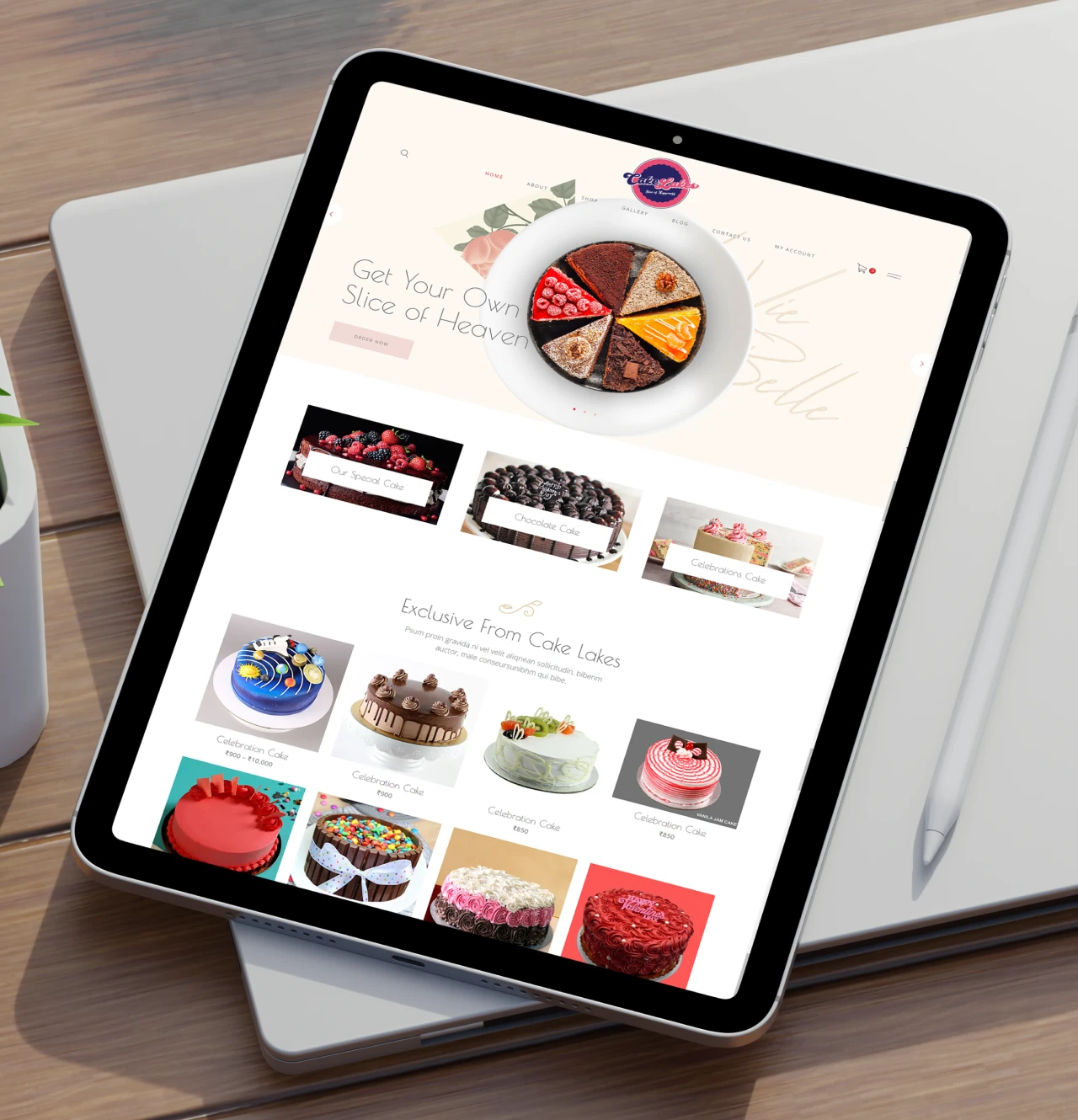
Website Development: Rainhopes developed a stunning and user-friendly website for Cake Lakes, designed to showcase their wide range of cake varieties and services. Our team of skilled developers created a custom website with an intuitive navigation structure, ensuring that visitors can easily explore and find the information they need. The website featured visually appealing layouts, captivating imagery, and an engaging user interface, providing a seamless browsing experience.
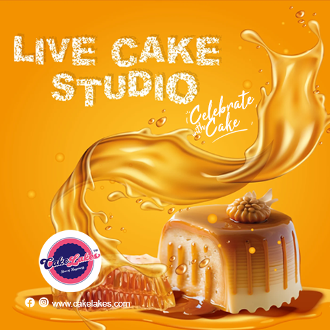
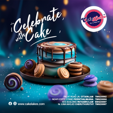
Banner Design: We designed eye-catching and impactful banners for Cake Lakes, both for their website and other marketing materials. Our creative team meticulously crafted banners that effectively conveyed Cake Lakes’ brand message and highlighted their diverse cake offerings. The banners featured vibrant colors, enticing visuals, and persuasive copywriting, capturing the attention of visitors and encouraging them to explore the website further.
Branding Support: In addition to web development, Rainhopes provided branding support to Cake Lakes. We worked closely with their team to develop a unique brand identity, which included logo design, color palette selection, typography, and brand guidelines. Our goal was to create a cohesive and memorable brand image that would resonate with Cake Lakes’ target audience and set them apart from competitors.
Result
Cake Lakes
The combined efforts of Rainhopes and Cake Lakes resulted in a visually appealing, user-friendly, and highly functional website. The website successfully showcased Cake Lakes’ cake varieties and services, attracting and engaging customers. The captivating banners further enhanced their online presence and helped drive customer conversions. With a strong and consistent brand identity, Cake Lakes established themselves as a trusted and sought-after cake making company.
We are honored to have been part of Cake Lakes’ journey by providing them with top-notch web development services, including logo design, website development, banner design, and branding support. At Rainhopes, our mission is to help businesses succeed online, and we take pride in delivering exceptional results that exceed our clients’ expectations.
To learn more about our web development and branding services, please visit our website at rainhopes.in. Contact us today to discuss how we can help your business thrive in the digital realm.
-

BIRD DIGITAL INC.
-

FOX ENTERTAINMENT
-

EAGLE SOLUTIONS
-

DEERS MEDICAL INC.
-

BIRD NATURAL PARKS